Hotel Digital Signage can make a hotel easier to navigate and its services easier to discover. But the best choice depends on the guest journey, not on screen size alone. A display beside the lobby entrance solves a different problem from a menu screen near a restaurant queue. Small placement decisions matter.
J.W. Marriott Jr., a longtime hotel industry leader, famously said, “Take care of your employees and they’ll take care of your customers.” That principle offers a useful test for Hotels Digital Signage: does each screen help staff serve guests, or add another task? A clear event schedule can reduce repeated directions at the front desk. A well-positioned wayfinding display can help guests find meeting rooms without stopping in a crowded corridor. Keep the message readable. Keep it current.
This guide explores hotel welcome boards, wayfinding screens, restaurant menus, event displays, and in-room signage. It considers where each type works, what information it should show, and how teams can manage updates. There is no perfect screen for every property. Bright animations may catch the eye, but they can also distract. A quiet, static display may be more useful. That trade-off deserves thought. The aim is practical: match the screen to a real guest need, then review whether it actually helps.
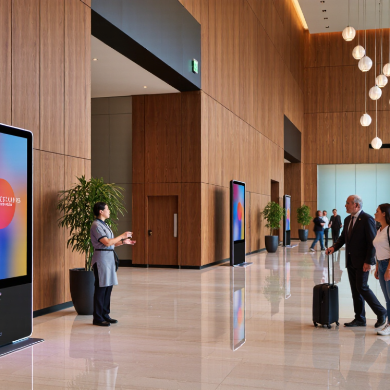
Hotel digital signage works best when each screen solves a clear guest need. Lobby displays can show breakfast hours, check-in guidance, weather, and shuttle times. A screen near reception is easy to notice, but too much text gets ignored. Use short headings, readable contrast, and information that matches the day. For example, a welcome message can change when a conference group arrives. Keep essential details available at the desk, too; screens can fail or confuse tired travelers.
Tips: Place directional screens at decision points, such as elevator lobbies and corridor intersections. Use meeting-room displays for schedules and room changes. Check visibility from a seated guest’s height. Keep messages brief. Update them regularly.
Common formats include menu boards, animated lobby screens, interactive kiosks, signs outside event rooms, and in-room television welcome pages. Interactive maps can help guests find the gym or a meeting suite without asking staff. But unclear menus may slow them down. A screen should not replace human help. Review content weekly and check time-sensitive details daily. Ask front-desk staff which questions guests repeat. Some placements may prove less useful than expected; simplify or move them instead of adding more screens.
Lobby and reception displays work best when they reduce uncertainty, not decorate the room. A 2022 hospitality industry report, Hospitality in 2025, found that 73% of travelers were more likely to choose hotels offering self-service technology that reduced staff contact. A clear lobby screen can support that preference without replacing human help. Show check-in steps, reception location, breakfast hours, and where to ask for assistance. Keep it legible. Use large type, strong contrast, and short directions that guests can read while pulling a suitcase.
At the entrance, a welcome message can point arriving guests toward check-in or a queue, while a separate screen can explain what to prepare. Avoid displaying room numbers or personal guest details in public. Update the content when reception hours or procedures change; stale directions quickly undermine trust. Less is better. A screen packed with promotions may hide the one instruction a tired traveler needs. Digital signage cannot fix a slow check-in or an understaffed desk, and it may confuse guests who prefer speaking with someone. That limitation matters: the display should guide, while staff remain easy to find.
Wayfinding screens work best where guests pause, hesitate, or need to choose a route: the lobby entrance, elevator bank, or corridor junction. A directory should show clear destinations, floor numbers, and a visible “you are here” marker. Use familiar labels such as “Guest Rooms” rather than internal department names. PwC’s 2018 Future of Customer Experience survey found that 73% of consumers consider experience an important factor in purchasing decisions. The study was not hotel-specific, but it underscores why small moments of friction matter.
Keep directions readable from a few steps away. Use strong contrast, plain language, and arrows that point toward actual landmarks. A screen near the lifts might list room ranges by floor, while a lobby display can guide guests to meeting rooms, dining, and restrooms. Add a printed directory nearby. It helps when screens are offline or guests prefer paper. That detail is easy to overlook.
Review routes with staff and guests, especially after renovations or event-space changes. A polished map can still send someone toward a locked door. That is a real failure, not a design preference. Check screen content regularly, and avoid showing more destinations than the location can support clearly. A short walking test can reveal confusing turns that look obvious on a floor plan.
In a hotel restaurant, digital menu displays help guests make quick choices while they are still near the entrance. Show dish names, prices, and useful details such as “contains nuts” in a clear, consistent layout. A close-up photograph can make a seasonal soup more inviting, but too many images compete for attention. Keep it readable. Update sold-out items promptly, especially during breakfast, when menus can change quickly. Staff should know who checks each screen and when; otherwise, yesterday’s special may linger past lunch.
Event displays serve a different purpose. Place schedules near elevators, meeting-room doors, and busy lobby paths, where guests naturally pause. Include session times, room names, and simple directions, such as “Level 2, Cedar Room.” When a speaker or room changes, update every relevant screen together. Guests notice mismatches fast. Use large type and strong contrast, since people often read while carrying bags or walking with a group.
A shared content system can reduce repeated edits, but it still needs human review. Check spelling, room numbers, and time zones before publishing, then ask staff to report confusing signs. Not every visitor will look at a screen, and glare can make a well-designed display hard to read. A printed schedule at the desk remains useful. Too many animated transitions may look lively to the design team, yet feel distracting to a guest trying to find a meeting.
Hotel amenity and guest room displays are most useful when they answer questions where they arise. Near a lobby elevator, a clear screen can show pool hours, fitness room access, breakfast times, and maintenance notices. Keep each item brief, with large type and strong contrast. Guests may be carrying bags or glancing up while walking. Small details matter.
Inside guest rooms, displays can present Wi-Fi instructions, housekeeping options, checkout times, and dining hours without adding another paper card. A simple layout helps guests find updates quickly. Use timestamps for changing information, and assign a staff member to review it each day. Outdated details damage trust. If the pool closes early, the notice should appear before guests reach the elevator, not after.
Displays should support, not crowd, the stay. A screen beside the bed that cycles through promotions may feel intrusive, especially at night; brightness controls and a quiet default are worth considering. Accessibility matters too: readable text, useful language choices, and a non-digital way to ask for help keep information available to more guests. Digital signage will not fix confusing service on its own. That part is easy to overlook.